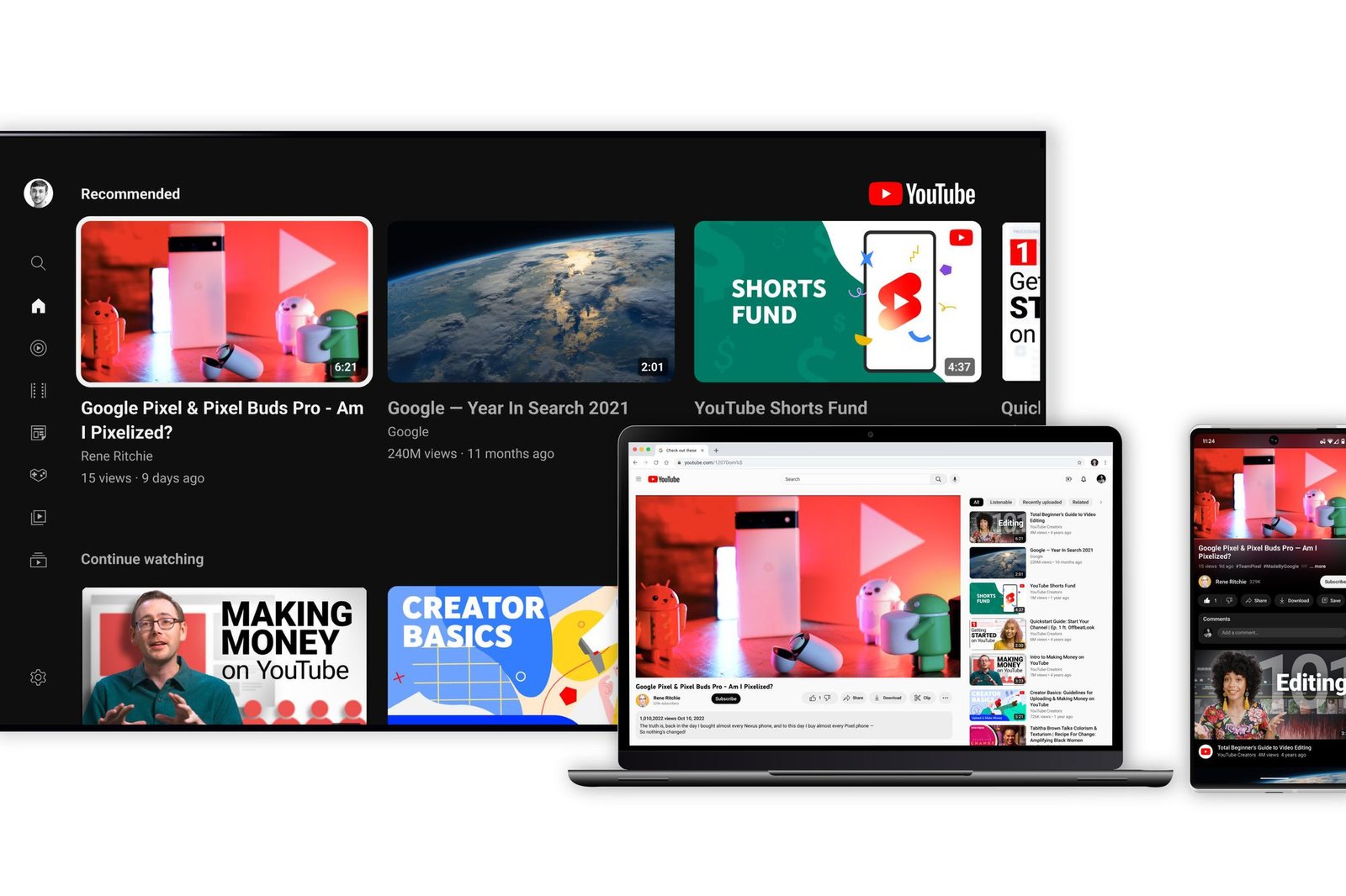
Recently, YouTube introduced a series of updates to its mobile app on both iOS and Android platforms. These changes aim to significantly improve user experience with redesigned interfaces, enhanced functionality, and a modern appeal. This article covers the highlights of these updates, detailing their impact on user interaction and overall satisfaction.
Redesigned Playback Speed Controls
New Interface and Features
YouTube has unveiled a sleek redesign for its playback speed controls, offering a more compact and user-friendly experience. Previously, the speed options were displayed in a tall sheet, occupying a substantial part of the screen. Now, users can enjoy a more visually appealing layout at the bottom of the screen. The update includes preset speeds of 0.25x, 1.0x (Normal), 1.25x, 1.5x, and 2.0x, neatly arranged in pill-shaped containers. A versatile slider allows custom speed adjustments in 0.05 increments, alongside intuitive ‘plus’ and ‘minus’ buttons.
Enhanced Usability
This redesign offers an enhanced aesthetic that significantly boosts usability. Users have responded favorably, noting the improvement over the previous interface. The ability to adjust speeds seamlessly without losing focus has been particularly appreciated, demonstrating YouTube’s commitment to an intuitive viewing experience.
Miniplayer Redesign on Android
Picture-in-Picture Functionality
Android users are greeted with a new miniplayer design that takes cues from picture-in-picture (PiP) functionality. The miniplayer is now a rectangular card with rounded corners, incorporating convenient play/pause buttons, as well as 10-second rewind and skip controls. This design choice enhances multitasking abilities, enabling viewers to continue watching content while navigating other apps.
User Interaction and Experience
The new miniplayer supports resizing to fit the full width of the screen, while also being repositionable for optimal viewing. An ‘x’ button allows for easy closure, and when users exit the app, the miniplayer transitions smoothly to the system’s PiP, offering an integrated experience.
Updated Mobile Settings Menu
Organized and Intuitive Navigation
A redesigned settings menu now greets YouTube users, featuring headers such as Account, Video and Audio Preferences, Help and Policy, and Developer Preferences. Each category is accentuated by thin outline-style icons, providing a more organized and intuitive navigation experience. This structured approach aids users in quickly locating and adjusting their app settings.
User Reception and Feedback
User feedback highlights satisfaction with the new settings menu, citing improved clarity and accessibility. The update marks a significant departure from previous designs, aligning more closely with user expectations for a streamlined interface.
New Mobile Player UI Testing
Smart TV-Inspired Design
In its latest testing phase, YouTube is exploring a smart TV-inspired user interface for its mobile app. Key UI elements have shifted, with the video title now visible just above the progress bar, followed by view count and publish date. Other elements like play/pause controls are repositioned to the lower left, emphasizing functionality and ease of use.
User Adaptation Concerns
The new design elicits mixed reactions from users, requiring them to adapt to changes in layout and functionality. Such transitions highlight the role of muscle memory in user interaction, but YouTube’s initiative reflects a willingness to innovate and test new user-driven designs.
Additional Features and Improvements
Introduction of a Sleep Timer
YouTube now features a sleep timer, granting users control over playback duration for added convenience. This feature is broadly available, reflecting user demand for customizable viewing options.
Video Chapters and Landscape Mode Enhancements
Further updates include improvements to video chapters, making them accessible directly beside play/pause controls in the bottom left. Additionally, users can benefit from an enhanced landscape mode and various usability tweaks, offering a more comprehensive viewing experience.
These updates are part of YouTube’s broader strategy to incorporate user feedback and modern design principles into its mobile app. As the platform evolves, users can expect continued enhancements that prioritize intuitive, engaging experiences.
For the latest updates and insights into YouTube’s mobile app developments, visit FROZENLEAVES NEWS.
“`
